According to visualteachingalliance.com, 90% of the information that enters our minds is visual.
A Forbes.com report discovered 65% of people are visual learners.
And according to research compiled by 3M, the company behind Post it notes, visuals are processed 60,000 times faster than words.
Images aren’t just important in your marketing, they are the marketing.
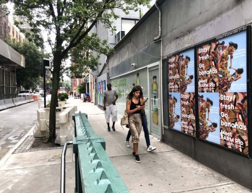
That goes double for Wild Postings, because more often than not they’re just images on a construction site or your neighborhood transit station.
But what makes a captivating image?
What does it take to craft a powerful visual that grabs your target market’s attention and gets them to take action?
Here are some key fundamentals.
Adjusting Images To Draw Focus
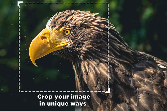
Cropping images in unique ways can draw your audience in and interest them in learning more about your product.
For example, if your Wild Posting boasts a picture of a mountain in a wide-angle shot, try removing some of the scenery so your eye drawn to the snowy peaks of the towering elevation.
Just be sure the cropped image is a worthwhile visual. The picture must be compelling all on its own.
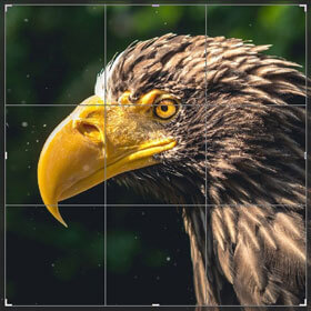 Thirds
A common photographer technique, the rule of thirds is presenting the image aspects in a way that harmonizes with people’s eyes in order to make the image more visually engaging.
The key to achieving this technique is to divide a picture into a grid of thirds, placing key aspects at their intersections without placing those aspects in the center of your picture.
Color Psychology
Colors possess tremendous influence on how we feel and the actions we take.
The digital marketing blog Wishpond reported a 14.5% increase in conversions after they changed their call-to-action button from yellow to green.
If something as simple as a small change of color on a CTA can change the course of a digital marketing campaign, what could the right color choices do for your Wild Posting?
Here is a quick guide to help you get started with colors and how they influence people:
Red – Creates a sense of urgency and stimulates appetite
Blue – Sense of security, lessons appetite, and stimulates productivity
Green – Creates harmony in your brain and enables a decisiones
Purple – Cultivates problem solving as well as creativity
Orange & Yellow – Happy colors that promote positivity
Black – Indicative of authority, power, stability and strength.
Shape Psychology

Marketers often turn to shapes and the way people respond to them to help them design an attractive logos and brands.
Circles imply love, companionship and union.
As opposed to triangles and squares that signify stability, strength, power and professionalism.
Vertical lines signify aggression and horizontal lines come across as peaceful and communal.
Gregory Visual Assumption Theory
Psychology Professor Richard Gregory at the University of Bristol spent his life running experiments on visual perception.
One of his cornerstone theories was Top-Down processing or Conceptual-Driven Processing.
The theory states simply when human beings form ideas of a person, place or thing, we start with the big picture and make the most educated guess on what we see based on our lifestyle, upbringing, biases beliefs etc.
Gregory’s theories imply that 90% of what we see dissipates long before the visual information reaches the brain. Your brain is aware of this fact and relies on best guesses based on all of your previous knowledge.
It also states that our surroundings help to provide context to the visuals we experience all around us.
Binocular Rivalry Phenomenon

A phenomenon discovered in 1988 by Psychologists , Frank Tong, Ken Nakayama, J. Thomas Vaughan, and Nancy Kanwisher, Binocular Rivalry happens when a person’s eyes see two contrasting images in the same location.
One image absorbs our focus while the other is pushed away.
The dominance of either varies from time to time, so instead of seeing both visuals at the same moment people end up seeing only one of the two visuals at any given time as they compete for our attention.
How do you avoid this phenomenon on your Wild Posting?
- Always aim for high contrast happening between visual and background information
- When picking out a color theme make sure the chosen shade cultivates harmony with other colors
- Use contrasting and chaotic color shades warily and ensure their implementation is intentional and thoughtful
Like most things in advertising, creating captivating images is part art and part science.
However, using these core ideas will give you a let up on the competition and set you on the road to creating a Wild Posting image your target audience will love.




Leave A Comment