According to visualteachingalliance.com, 90% of the information that enters our minds is visual.
A Forbes.com report discovered 65% of people are visual learners.
And according to research compiled by 3M, the company behind Post-it notes, visuals are processed 60,000 times faster than words.
Images aren’t just important in your marketing — they are the marketing.
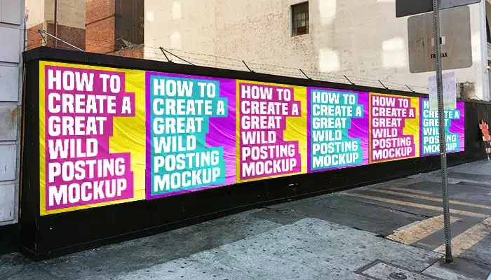
That goes double for Wild Postings®, because more often than not they’re just images on a construction site or your neighborhood transit station.
But what makes a captivating image?
What does it take to craft a powerful visual that grabs your target market’s attention and gets them to take action?
Here are some key fundamentals.
Adjusting Images to Draw Focus

Cropping images in unique ways can draw your audience in and interest them in learning more about your product.
For example, if your Wild Posting® features a mountain in a wide-angle shot, try removing some of the scenery so the eye is drawn to the snowy peaks.
Just be sure the cropped image is compelling on its own.
Rule of Thirds

The rule of thirds is a classic photography technique. It makes an image more visually engaging.
Divide the picture into a grid of thirds. Place key elements at the intersections rather than the center of the image.
Color Psychology

Colors strongly influence how we feel and how we act.
The digital marketing blog Wishpond reported a 14.5% increase in conversions after changing a call-to-action button from yellow to green.
If a small color change can impact digital performance, imagine what the right color choices can do for your Wild Posting®.
- Red – Creates urgency and stimulates appetite
- Blue – Suggests security and productivity
- Green – Creates harmony and balance
- Purple – Encourages creativity and problem solving
- Orange & Yellow – Promote positivity and energy
- Black – Conveys authority, power, and strength
Shape Psychology

Marketers use shapes strategically when designing logos and brands.
- Circles imply unity, love, and companionship
- Triangles and squares suggest stability and professionalism
- Vertical lines feel aggressive
- Horizontal lines feel calm and communal
Gregory’s Visual Assumption Theory
Psychology Professor Richard Gregory of the University of Bristol studied visual perception extensively.
His theory of Top-Down Processing suggests we interpret visuals using prior knowledge, lifestyle, and beliefs.
Much of what we see fades before reaching full awareness. Our brains fill in the gaps based on experience and context.
Binocular Rivalry Phenomenon

Binocular rivalry occurs when two conflicting visuals compete for attention in the same space.
One image dominates while the other fades. The brain switches between them instead of processing both equally.
To avoid this in your Wild Posting®:
- Use strong contrast between image and background
- Choose color palettes that work harmoniously
- Avoid chaotic color clashes unless intentional
Like most things in advertising, creating captivating images is part art and part science.
Using these principles gives you an advantage and helps create a Wild Posting® image your audience will love.