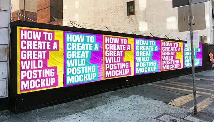
When presenting a Wild Posting® campaign, your mockup has one job: sell the vision. Posters shouldn’t just sit on a wall — they should feel embedded in the environment. Gritty, believable, and magnetic enough that a client or creative director can instantly imagine the real-world execution.
This step-by-step guide walks through proven techniques to help your Photoshop wild posting PSD mockups feel authentic, tactile, and ready for the street.
1. Choose the Right Background (Texture Matters)
- Start with high-resolution urban textures: concrete, brick, chipped paint, grime.
- Whenever possible, shoot your own background photography for originality.
- Look for imperfections—cracks, paste residue, torn paper, faded layers.
The background sets the tone. If it feels real, everything placed on top of it will follow. Study real Wild Posting® installations to understand how surfaces age and interact with paper.
2. Match Scale and Perspective Precisely
- Use Photoshop’s Distort or Perspective Warp tools to match wall angles.
- Reference real-world objects like bricks, pipes, doors, or signage for scale.
- Test scale with a single poster before duplicating across the surface.
Before and After: Wild Posting® Mockup
Below is a side-by-side comparison showing how texture blending, lighting, and wear effects transform a flat mockup into a convincing Wild Posting® installation.

Before: Poster placed without environmental texture or realism.

After: Poster blended with wall texture, lighting, shadows, and wear.
3. Add Imperfections to Poster Layers
- Use Displacement Maps to simulate surface texture beneath the paper.
- Mask edges softly to mimic peeling, tearing, or uneven paste.
- Experiment with Multiply, Overlay, or Soft Light blending modes.
Perfect edges kill realism. Hand-applied posters always show variation.
4. Layer in Real-World Wear and Tear
- Fade or desaturate areas to simulate sun exposure.
- Add subtle grunge overlays for age and grit.
- Use Warp or Puppet Warp to create curling or buckling edges.
Resources like Behance and texture libraries from Textures.com can provide useful reference material.
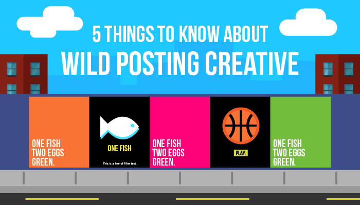
5. Create Organic Groupings and Overlaps
- Avoid perfect alignment — slight misplacement feels more authentic.
- Layer posters to replicate real-world overlap.
- Introduce variation with torn or partially covered copies.
6. Dial in Lighting and Color Grading
- Match the direction and temperature of ambient light.
- Add subtle shadows beneath edges and folds.
- Use adjustment layers to unify the final composite.
7. Add Environmental Details
- Include small street details like graffiti, old paste layers, or debris.
- Apply light grain or noise across the entire image.
- Use depth-of-field blur to mimic real camera focus.
Final Thoughts
Whether you’re working from a wild posting PSD template or building from scratch, perfection is the enemy. Believability comes from texture, wear, imbalance, and restraint.
When scale is right, lighting is consistent, and posters feel weathered and lived-in, your mockups stop looking like concepts — and start looking inevitable.
Explore real-world executions and campaign examples at WildPosting.com.