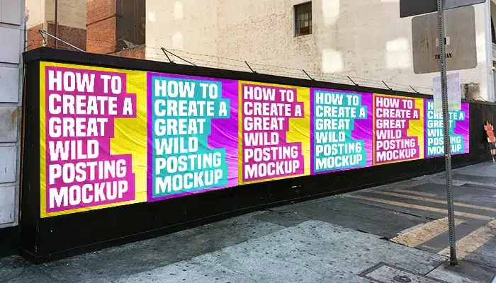
Good Wild Posting® Creative vs. Bad: How to Tell the Difference
When creating outdoor advertising campaigns like Wild Posting®, having standout creative is essential. Exceptional creative grabs attention, communicates the message effectively, and leaves a lasting impression.
On the other hand, weak creative can confuse the audience, fail to deliver the intended message, or be forgotten as soon as it’s seen. By following proven design rules, businesses can ensure their campaigns achieve maximum impact.
1. Use High-Contrast Colors
Colors are a key factor in visibility. High contrast between text and background makes your message stand out, even from a distance. For example, a light font on a dark background or vice versa ensures readability.
- Avoid: Washed-out colors or low contrast combinations (e.g., pastel-on-pastel designs).
- Overloading the poster with too many bright colors that clash.
By prioritizing contrast, you increase the chances of catching someone’s eye in the busy urban landscape.
Explore more Wild Posting® design principles.
For additional insights into color theory and contrast in design, visit Canva’s Color Wheel Tool.
2. Opt for Readable Fonts
Fancy, intricate fonts may look artistic but often compromise legibility, especially in outdoor advertising where people view your content for only a few seconds.
- Best Practices: Use clean, bold fonts like sans-serif styles.
- Test the readability from at least 10 feet away to simulate real-world visibility.
Avoid: Fonts with excessive flourishes or mixing multiple font types that can appear chaotic.
Readable fonts ensure that your message is communicated instantly, even as people pass by.
For tips on selecting professional fonts, check out Font Squirrel.
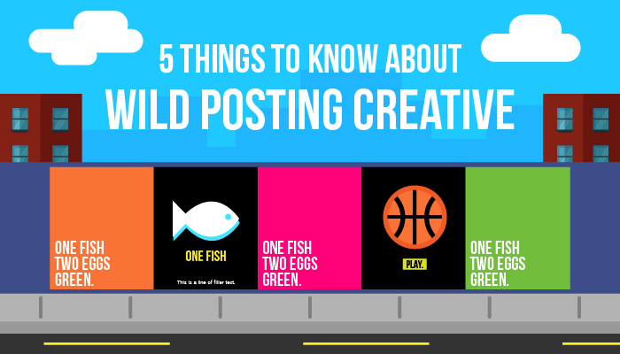
3. Keep Your Word Count Minimal
The best Wild Posting® creative delivers its message in five words or fewer. A concise message is easier to absorb and makes a stronger impact.
- Tips: For product promotions, include only the product name and launch date.
- For events, use just the event name, date, and location.
Avoid: Lengthy descriptions or unnecessary details.
Learn more about crafting concise messaging for outdoor campaigns at Adweek.
4. Avoid White Backgrounds
White backgrounds in urban areas are often seen as blank canvases for graffiti artists. Opt for colored or textured backgrounds to deter tagging.
- Example: Use bold, vibrant colors like black, red, or neon shades to fill the space.
- Include patterns or gradients to create interest without overwhelming the design.
Avoid: Pure white or light gray backgrounds, as they invite defacement.
For creative inspiration on textured backgrounds, explore Unsplash’s Texture Backgrounds.
5. Utilize QR Codes Over URLs
QR codes have revolutionized Wild Posting® by providing instant digital access to campaigns. They are:
- Easy to use: Scanned directly with a smartphone.
- Trackable: Measure engagement and ROI by monitoring QR code activity.
Avoid: Long URLs that are difficult to remember or type. Adding unnecessary phone numbers, which are rarely used.
Learn how to generate professional QR codes for your campaigns at QR Code Generator.
6. Avoid Campaigns Based on “Payoffs”
Teaser campaigns that rely on a big reveal (e.g., cryptic messages with no context) often fall flat because many people won’t return to the same location to see the follow-up. Audiences may forget about the initial teaser entirely. Instead, use Wild Posting® to deliver a clear and immediate message that hooks your audience the first time they see it.
Conclusion
Good Wild Posting® creative is about simplicity, readability, and impact. By using high-contrast colors, clear fonts, minimal text, and QR codes, businesses can create ads that resonate with audiences and deliver results. Avoid common pitfalls like cluttered designs, overuse of white space, or confusing teasers. With the right strategy, Wild Posting® can be a powerful tool for branding and engagement.
Tailored Wild Posting® Design Checklist
- High-Contrast Colors: Select contrasting colors for text and background (e.g., black text on yellow, white text on red).
- Readable Fonts: Use simple sans-serif fonts like Helvetica and test readability from a distance.
- Minimal Word Count: Keep messages under five words for immediate impact.
- Backgrounds: Avoid white backgrounds to deter tagging.
- QR Code Integration: Use QR codes for easy user engagement and tracking.
Pro Tip: Before launching your campaign, test your design under real-world conditions to ensure clarity and effectiveness.